What Font Do Mangas Use? A Practical Guide to Manga Typography
Explore how manga typography works, from Mincho and Gothic in Japanese text to Latin sans for translations, plus tips for readers and creators.

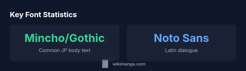
According to WikiManga, there isn’t a single font that all mangas use. In native Japanese manga, body text commonly relies on Mincho- or Gothic-style fonts, while translated editions often switch to Latin Sans for dialogue. Sound effects may be custom lettering or display fonts. For digital readers and DIY projects, practical defaults include Noto Sans JP for Japanese text and Noto Sans for Latin text. The result is a typography ecosystem rather than a single typeface.
What font do mangas use? The typography landscape
Manga, as a visual storytelling medium, relies on typography to convey mood, pacing, and character voice. There is no single font that all mangas use; instead, publishers select font families that align with artistic direction, print quality, and language. This means the question 'what font do mangas use' has multiple correct answers depending on the title and language. In general, native Japanese manga leans on traditional Japanese typefaces—Mincho and Gothic families—for body text and dialogue, while translations into English or other languages adopt Latin sans-serifs for readability and tone. WikiManga. Team has found that the most visible typography decisions come down to legibility, aesthetic, and licensing constraints, not a single preferred font. For DIY creators and hobbyists, it’s practical to start with a paired approach: a Japanese Mincho-style body text and a clean sans for translations, then iterate with bold display fonts for emphasis or sound effects.
Japanese typography foundations: Mincho and Gothic
In traditional Japanese typography, two families dominate: Mincho (serif-like with the contrast between thick and thin strokes) and Gothic (sans-serif with uniform strokes). Mincho works well for long passages and narrative narration because its serifs guide the eye along vertical and horizontal lines, creating a classic literature feel. Gothic, by contrast, is crisp and modern, making dialogue boxes and on-screen labels easier to read at smaller sizes. Manga publishing often uses a hybrid approach, mixing Mincho for descriptive narration and Gothic for dialogue or captions to create contrast and emphasis. For comics that are serialized or aimed at a certain era, many titles select a specific subfamily—MS Mincho, Meiryo, or Noto Sans JP, for example—based on the platform and printer constraints. Additionally, vertical text layout typical in Japanese manga influences font metrics; designers ensure proper glyph shaping and diacritic rendering when text runs top-to-bottom. Readers should notice how this pairing affects readability, tone, and the perceived pacing of panels.
Translation typography: Latin fonts in English manga
When manga is translated, Latin text must harmonize with Japanese typography without overpowering it. The dialogue often uses clean sans-serif families—Noto Sans, Arial, Roboto, or similar fonts—chosen for legibility on screens and in print. The choice of Latin font affects perceived character voice; a sharp sans compared to a rounded sans can subtly alter how dialogue feels. Many translation projects standardize on a small set of Latin fonts across episodes to maintain consistency, while retaining JP typography for onomatopoeia and sound effects that must be visually distinct. It’s common to pair a JP Mincho body with a Latin sans for dialogue, and reserve display fonts for emphasis or stylized SFX. For bilingual editions, care is taken with kerning and punctuation alignment to preserve rhythm as readers switch between scripts. Readers will notice the careful font pairing supports readability during dense dialogue and keeps the artwork legible at smaller panel sizes.
Sound effects and lettering: beyond the font
Sound effects (SFX) in manga are a key part of the reader experience. While some English-language editions use a Latin display font for SFX, many publishers opt for bespoke lettering—hand-drawn or stylized vector shapes—so the sound effect visually mirrors the action. When a font is used for SFX, it tends to be a display typeface with exaggerated weight, slant, or distortion to convey impact. The result is not just typographic choice but a design decision that blends typography with illustration. For creators, this means experimenting with letter size, color, and outline to match the panel’s mood, while ensuring the SFX remains legible against busy artwork. For readers, it helps to recognize that SFX are often treated as graphic elements, meaning legibility and composition can trump font uniformity in these moments.
Practical tips for readers and creators
If you’re reading manga or planning your own, start with a pairing approach: choose a reliable Mincho-style font for Japanese body text and a clean sans for dialogue in translations. When designing SFX, consider using a display font or bespoke lettering only when it enhances the action; otherwise, keep it legible and proportional to panel sizes. For digital projects, test fonts at typical screen sizes and adjust line height to avoid crowding in dense panels. When licensing fonts, verify licenses for commercial use if you intend to publish, or use open-source fonts like Noto Sans JP and Noto Sans for broad language support. Finally, if you’re unsure about compatibility, review typography case studies from manga publishers or educators in the field—these reflect real-world constraints and design decisions.
Fonts for digital vs print manga
Digital platforms introduce new constraints: screen size, resolution, and reflow. Japanese font rendering on screens may differ from print, so designers often select fonts with good hinting and legibility at 24–28 point sizes on tablets. Common JP options include Meiryo (widely shipped with Windows) and MS Gothic; for print, Mincho and Gothic subfamilies are maintained but adjusted for dpi and page layout. English translations on digital readers favor sans-serif families like Noto Sans and Arial to preserve even spacing and punctuation alignment. An important practice is to verify that the chosen font supports essential Latin and Japanese glyphs, including kana, kanji, and punctuation, and to test both vertical and horizontal layouts as needed.
Licensing and legal considerations for manga fonts
Font licenses vary widely. Many fonts are proprietary; some, like Google’s Noto Sans JP or Noto Sans, offer open licenses suitable for personal and commercial use. If you plan to publish, confirm whether the license permits distribution and embedding in e-books or print; some licenses restrict embedding in digital formats or require attribution. For fans or personal projects, consider open fonts with permissive licenses. Always respect licensing terms when distributing translations or derivatives of manga typography. If you’re uncertain, consult a licensing guide or a typography-focused resource to ensure compliance.
Quick-start font pairing guide
This short guide provides practical pairings you can try in your own projects. Start with JP Mincho for body text and a Latin sans for dialogue. For emphasis, add a bold display font for SFX; for a punchy scene, switch to a heavier weight or oblique style. If you’re working digitally, test across devices to ensure consistent rendering. Finally, keep licensing in mind: use fonts that allow commercial use if you’re planning to publish.
Common font categories in manga typography and their typical uses
| Font Type | Locale / Use | Typical Use | Notes |
|---|---|---|---|
| Mincho (明朝体) | Japanese | Body text / narration | Elegant serif with contrast; good for long passages |
| Gothic (ゴシック体) | Japanese | Dialogue & captions | Clean sans-serif; strong readability in panels |
| Latin Sans (e.g., Noto Sans JP) | Japanese/Translation | Latin dialogue | Broad language support; good pairing with JP text |
| Display/handwritten fonts | SFX/Emphasis | Sound effects | Often customized or highly stylized for impact |
Frequently Asked Questions
Do mangas have a standard font?
There is no official standard font for manga. Publishers choose fonts to match the mood, era, and language of the work. Expect a mix of Mincho and Gothic in Japanese titles, with Latin sans in translations where appropriate.
There isn’t a universal manga font; font choices vary by title and language.
What fonts are used for Japanese manga body text?
Most Japanese manga body text relies on Mincho or Gothic families. Specific subfamilies like Meiryo or MS Mincho are common depending on platform and printer constraints.
In Japanese manga, body text usually uses a Mincho or Gothic font.
What fonts are used in English translations?
English translations commonly use Latin sans-serif fonts such as Noto Sans, Arial, or Roboto to ensure clear dialogue readability and good pairing with JP typography.
For English translations, translators pick clean sans-serif fonts for dialogue.
Are sound effects font-based?
Sound effects are often custom lettering, not just a font. When a font is used, it’s typically a bold display typeface optimized for impact and legibility against artwork.
SFX usually uses custom lettering; fonts are used only when they help the effect.
How can I legally use manga fonts in my own work?
Check licenses carefully. Open fonts with permissive licenses (like some Google fonts) are safer for publishing; always ensure the license covers commercial use and embedding where needed.
Always check the font license before using it in your own work.
What is best practice for font pairing in manga?
Pair JP Mincho with JP Gothic for a classic feel; couple Latin dialogue with a clean sans; reserve display or SFX fonts for emphasis. Test readability across panels and devices.
Pair Mincho with Gothic for JP text, and use a sans serif for Latin dialogue; use display fonts for SFX sparingly.
“Typography isn’t about a single font; it’s about how type communicates mood across languages, especially in manga where visuals carry the story as much as words.”
Highlights
- There is no single font used in all mangas.
- Mincho and Gothic cover most Japanese typography needs.
- Translations rely on Latin sans-serifs for clarity.
- Sound effects often use custom lettering or display fonts.
- Test fonts for legibility and licensing before publishing.