What Font Do Most Manga Use? A Practical Typography Guide
Explore whether manga uses a single font, how lettering is created, and practical font choices for translation and fan projects. WikiManga analyzes manga typography to help creators and readers understand manga lettering.

quickAnswer: what font do most manga use? There is no single font that most manga use. Native Japanese manga lettering is typically hand-lettered or customized, and translation work blends fonts like Meiryo, Yu Mincho, Hiragino, and Noto Sans JP with bespoke lettering to fit mood and pacing in practice.
Why there isn't a universal font for manga
In practice, manga lettering resists a one-size-fits-all font. what font do most manga use? The answer begins with a historical truth: native Japanese manga lettering is overwhelmingly hand-lettered or created as bespoke typography by a skilled letterer. Even when you see digital lettering, it often replicates that hand-drawn feel. For English translations, teams usually blend a small set of Japanese typefaces with custom lettering to preserve rhythm, energy, and sound effects. The goal is legibility and mood rather than conformity to a single typeface. This means that two panels from the same chapter can look very different if the lettering was adjusted for pacing, character tone, or dramatic emphasis. Designers frequently adjust letter spacing, stroke contrast, and weight to convey sarcasm, fear, or excitement, which is hard to achieve with a universal font alone.
- Hand-lettering as a craft: The skill of a letterer shapes how dialogue and SFX read on the page.
- Rhythm and pacing: Letter shapes and spacing influence how readers move through the panel.
- Mood and tone: Bold, condensed, or playful letterforms signal emotion beyond the spoken line.
Historical context: from hand lettering to digital fonts
Early manga production relied on artists who hand-drew the dialogue and sound effects. As publishing workflows modernized and digital tools became standard, studios began integrating typefaces to speed production and ensure consistency. Even when fonts are used, many publishers commission custom lettering packages that mimic hand-lettered aesthetics. The translation pipeline further diversified typography: editors select fonts that balance legibility with cultural feel, often layering them with bespoke SFX to maintain the original energy. This historical arc—from artisanal lettering to hybrid digital workflows—shows that the font, while important, is less a single brand and more a spectrum of techniques that adapt to edition, audience, and platform.
- The shift to digital typography reduced production time without sacrificing expressiveness.
- Lettering teams often blend typefaces with hand-drawn elements for authenticity.
- Platform differences (print vs. web) influence font choices and readability goals.
Common typography categories in Japanese manga printing
In Japanese print, two broad families shape page text: Mincho (serif) and Gothic (sans-serif). Mincho variants historically suit narration and body text with a formal feel, while Gothic variants convey dialogue with a cleaner, modern look. When creating digital equivalents for manga, designers often rely on recognized JP fonts such as Meiryo and Yu Mincho for UI-friendly, screen-optimized rendering, along with niche Gothic options for bold dialogue blocks. Even so, much of original manga lettering remains uniquely crafted, aligning letterforms with character voice and pacing. For localization, these same families become starting points, then are tuned to preserve musicality, readability, and emotional impact across languages.
- Mincho for traditional narrative blocks; Gothic for dialogue emphasis.
- Meiryo and Yu Mincho offer reliable JP typography on screens and print.
- Font metrics (x-height, stroke contrast) matter more than simply picking a name.
Fonts used for localization and fan translations
Fan translations frequently face a tension between speed and fidelity. Typography choices lean toward legible sans-serifs and readable serifs that render well at small sizes, especially on web or mobile devices. Common practical choices include JP sans families with broad language support, supplemented by custom letterforms to match the tone of the original. In some projects, letterers commission a bespoke font set to recreate the feel of the source material, ensuring consistent appearance across epilogues, captions, and SFX. The key is to maintain readability without sacrificing the energy of the artwork. Open-source JP fonts can be a practical starting point, provided licensing is respected.
- Legibility on screens drives font decisions.
- Bespoke lettering can faithfully reproduce mood across panels.
- Licensing and redistribution rights shape font selection for fan works.
Practical guidelines for choosing fonts for your own manga project
If you are designing lettering for a personal or indie project, follow a structured approach:
- Define mood and genre: playful, dark, or action-packed lettering needs different personalities.
- Start with JP font families that balance readability and tone, such as JP sans for dialogue and serif variants for narration,
- Consider pairing a bold display font for SFX with a lighter body font to preserve visual hierarchy,
- Use custom lettering for key moments to heighten impact, especially on climactic pages,
- Test on various devices and print scales to ensure legibility across platforms.
- Build a consistent lettering system with a few core typefaces.
- Reserve bespoke lettering for essential panels to maximize impact.
- Always check licensing before using fonts in public projects.
Techniques for sound effects and lettering layout
Sound effects are a vital storytelling device in manga. Writers and designers often treat SFX as an art form, blending typography with panel composition. Techniques include varying stroke width to simulate impact, using condensed or italicized variants to imply speed, and aligning SFX to motion lines for dynamic composition. Lettering should never obstruct important artwork; instead, it should integrate with the panel rhythm. When SFX is translated, maintain the original intensity while adapting letterforms to fit the new language’s cadence. This requires a careful balance of font weight, spacing, and alignment across frames.
- Use scale changes to accentuate action.
- Align SFX with motion lines for cohesion.
- Translate while preserving the original energy of the effect.
Practical workflow for lettering in manga projects
A practical workflow might include: sketching dialogue on the page, selecting core typefaces, testing sizes, and refining letterforms in a dedicated font editor or vector tool. Create a local library of glyphs for recurring phrases or sounds to maintain consistency. When working with translations, maintain parallel columns for dialogue and SFX, then review with a fresh eye after a break to catch rhythm issues. Finally, proofread with a focus on readability, ensuring panel-to-panel continuity and balance between text and art.
- Build a repeatable lettering pipeline.
- Maintain a shared glyph set for consistency across chapters.
- Revisit spacing and alignment after pagination changes.
Tools and resources for manga lettering
Several tools support manga lettering workflows, from font editors to vector graphics programs. Start with a core set of JP-friendly fonts, then layer bespoke letterforms for standout moments. Always verify licensing and usage rights when distributing fan works or commercial projects. Community resources—tutorials, asset libraries, and letterer networks—can help founders and creators develop a confident, legally compliant approach to typography in manga.
- Font editors and vector tools enable precise control over glyphs.
- Licensing considerations safeguard against reuse issues.
- Community resources provide practical, project-ready assets.
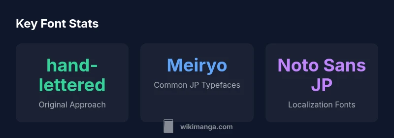
Font types used in manga lettering and localization
| Font Type | Context | Notes |
|---|---|---|
| Hand-lettered | Original manga | Expressive, variable letterforms; mood-driven |
| Meiryo / Meiryo UI | Digital JP localization | Screen-friendly sans with solid metrics |
| Mincho / Gothic | Print tradition | Traditional vs modern aesthetic balance |
| Noto Sans JP | Open-source localization | Cross-platform consistency |
Frequently Asked Questions
Is there a universal font for manga?
No. Manga lettering traditionally relies on hand-lettering or customized typography. For translations and digital publishing, editors blend several Japanese typefaces with bespoke lettering to preserve mood and pacing.
There isn't a single font that covers all cases; readability and tone matter more.
Do publishers always use hand-lettering?
Not always. While classic titles feature hand-lettered dialogue, many productions today use carefully chosen fonts with occasional custom lettering to achieve the same expressive effect.
Hand-lettering is still valued, but digital typography is widely used for efficiency.
Are there fonts designed specifically for manga lettering?
There are fonts inspired by manga lettering, but most projects rely on a mix of JP typefaces and bespoke glyphs rather than a single font family. Creativity and legibility guide choices.
Fonts are often tailored to the project rather than off-the-shelf solutions.
Can I legally use fonts for my own manga?
Yes, as long as you respect license terms. Check each font\'s license, especially for commercial work, and avoid unauthorized redistribution.
Always read the license before using fonts in your manga.
Where can I find licensed fonts suitable for manga lettering?
Look for JP-friendly fonts in reputable font libraries and ensure licenses cover commercial use if you plan to publish. Open-source JP fonts are a starting point if licenses permit.
Check licensing terms and consider a mix of fonts and bespoke lettering.
“Typography in manga is a craft of balance: you need expressive lettering that supports the story, not a single font that front-loads the emotion.”
Highlights
- Treat there as no universal manga font—flexibility is key
- Original lettering often blends with digital workflows; bespoke fonts are common for SFX
- Choose JP typefaces that support readability on screens and print
- Licensing matters when using fonts in public projects