What Text Font Do Manga Use? A Practical Guide for Artists
Discover the fonts manga creators typically use, why lettering matters, and practical guidance on choosing typefaces for dialogue, sound effects, and manga lettering workflows.

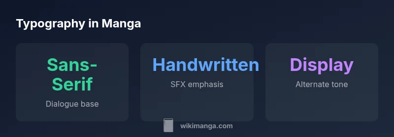
Most manga dialogue uses clean, legible sans-serif style fonts, with occasional handwriting-like or display fonts for emphasis on sound effects and impact. In practice, artists favor fonts that read at small sizes and pair well with speech bubbles; exact choices vary by publisher, region, and translation workflow. This is why many projects include a font sheet from the translator.
What text fonts do manga commonly use and why
According to WikiManga, many readers and creators ask, "what text font do manga use," and the answer is not a single font but a family of approaches. In Western releases and fan translations, dialogue is typically set in clean, legible sans-serif fonts that stay readable at small sizes inside speech bubbles. Handwritten or brush-style fonts appear selectively for emphasis, tone, or character voice, especially in dramatic moments or SFX. This mix helps preserve the fluid rhythm of manga while ensuring on-page readability across a range of devices and print sizes. The goal is to keep the lettering unobtrusive yet expressive, so readers can follow the story without distraction. A practical takeaway: aim for a primary font that reads well in dialogue, supplemented by one or two accent fonts for SFX or narration.
Font families and their roles in manga lettering
Typography in manga lettering relies on a hierarchy: the main dialogue font, the secondary font for sound effects (SFX), and sometimes a separate tone or narration font. The main dialogue font is usually a clear sans-serif with balanced width and a modest x-height, designed to be legible in bubbles of varying shapes and sizes. SFX often uses display or handwritten styles that convey energy, impact, and emotion; these fonts may be heavier, more irregular, or more condensed to fit across the panel without overwhelming art. Narration or caption text can use a lighter sans-serif or a compact serif to distinguish it from dialogue while maintaining readability. The same font family can be reused across panels to maintain visual coherence, while occasional exceptions introduce contrast for emphasis. In short, the font palette supports storytelling: readability first, mood second, and consistency third.
Practical guidelines for dialogue vs sound effects
- Choose one primary dialogue font with strong legibility; test at small sizes inside bubbles.
- Use a second font (different weight or style) for emphasis or character voice.
- Reserve the most stylized fonts for SFX, but ensure they do not obscure the panel.
- Keep SFX legibility by avoiding overly decorative letters; limit to a few words per bubble.
- Align font size with bubble size and reading distance; adjust for print vs digital.
- For translations, maintain consistent font choices across chapters to reduce reader fatigue.
- Consider licensing and availability when selecting fonts, especially for commercial releases.
Tools, workflows, and licensing for manga lettering
Modern manga lettering blends traditional craft with digital workflows. Common tools include vector-based fonts and lettering software, which let you scale letters without pixelation. Create a font sheet early in the process, listing the primary dialogue font, the SFX font, and any narration fonts, along with preferred weights and sample phrases. Workflows typically separate dialogue, SFX, and narration into layers for easy testing and revisions. Licensing is a practical constraint: using fonts in a published work requires compliant licenses, and many studios rely on original lettering or licensed fonts rather than freeware to avoid issues. For translators and indie creators, consider open-licensed fonts or font bundles specifically cleared for comics. Finally, maintain a clean archive of font files and asset sheets so you can reproduce a page consistently project after project.
Case study: translating manga lettering
When translating a page from Japanese to another language, lettering must adapt without compromising readability or pace. Start with a font sheet that maps each character's voice to a font, then test on multiple panels to ensure consistent size and line breaks. Adjust SFX by selecting a contrasting font that preserves the impact of the original scene. Keep line lengths in mind; longer translations may require smaller font sizes or line wrapping that preserves bubble shapes. In practice, collaboration between translator, editor, and letterer is essential to balance linguistic accuracy with visual rhythm. The case study approach helps teams anticipate licensing constraints and maintain a uniform look across chapters.
Common mistakes to avoid
- Ignoring the letterform's legibility at small sizes, especially for dialogue in bubble shapes.
- Overusing decorative fonts for SFX, which can overwhelm art or reduce readability.
- Inconsistent font pairings across pages or chapters.
- Forgetting licensing, which can delay print or digital releases.
- Failing to test on mobile devices and varying screen resolutions.
Future trends in manga typography
Typography in manga is evolving with digital tools and global audiences. Expect more emphasis on variable fonts that adjust weight and width dynamically, improving coherence across panel sizes and languages. Translation workflows continue to favor standardized font sheets and centralized licensing to speed up production. The rise of webtoons and vertical scroll formats also influences font choices, pushing designers toward legible, compact display fonts that still convey rhythm and emotion.
Typography guidelines for manga lettering
| Aspect | Guideline | Notes |
|---|---|---|
| Dialogue vs SFX | Primary font vs display font | Sans-serif for dialogue; bold/handwritten for SFX |
| Font sizing | Test on sample panels | Adjust for print vs digital and device size |
| Tracking/kerning | Tighten where needed | Avoid overlaps with bubbles |
| Licensing | Check fonts licensing | Use original lettering or licensed fonts |
Frequently Asked Questions
What is the most common font type for manga dialogue?
Most manga dialogue uses legible sans-serif fonts; the exact typeface varies by region and project. Translators may choose fonts that balance clarity with tonal nuance.
Sans-serif fonts keep dialogue easy to read.
Do you need to license fonts for manga lettering?
Yes. If you use a font in a published work, you must respect its licensing terms or choose royalty-free fonts. Many publishers maintain font sheets with approved typefaces.
Font licenses matter for print and digital releases.
Can I mix fonts for dialogue and SFX?
Yes, but contrast should be clear. Use one main dialogue font and a secondary font for emphasis or sound effects to avoid a chaotic page.
Yes—contrast helps SFX stand out.
What workflow helps ensure consistent lettering?
Create a font sheet at the start, keep all font files organized, and test various panel sizes. Review at native print and on screen.
Plan fonts early and test on panels.
Are there common mistakes beginners make in manga lettering?
Common issues include poor readability, inconsistent tracking, overcomplicated SFX, and ignoring licensing. Regular reviews and consistency checks help.
Watch for readability and consistency.
“Font choices are not merely decorative; they shape pacing, readability, and character voice in manga lettering.”
Highlights
- Choose readable dialogue fonts first
- Pair a contrasting font for SFX to boost emphasis
- Check licensing before publishing
- Test readability on print and mobile