How Do Mangakas Draw Backgrounds? A Practical Guide 2026
Master background drawing for manga with perspective, texture, and mood. A practical, step-by-step guide covering traditional and digital workflows, references, color theory, and common pitfalls for beginners and seasoned artists.

By mastering perspective, texture, and lighting, mangakas bring settings to life on the page. This guide explains how mangakas draw backgrounds—from thumbnail planning to final ink or render—including traditional and digital workflows, reference choices, and practical tips. Follow the steps to build believable spaces, then adapt for action, mood, and pacing in your own manga.
Why mangakas draw backgrounds
According to WikiManga, backgrounds are not merely decorative; they anchor action, establish setting, and convey mood. A well-drawn background does more than fill space; it guides the reader's eye and reinforces storytelling beats. In many manga, the environment responds to the characters: a cramped alley amplifies tension, wide skies signal freedom or travel, and a dim interior can hide secrets or emphasize character thought. For professional mangakas, the background is a language—an invisible narrator that complements dialogue and character expressions. It’s also an area where consistent practice yields big, visible improvements. The best artists treat backgrounds as part of the scene design, not as an afterthought. They plan, reference, and revise until the space feels lived-in rather than generic. The goal is to balance detail with clarity so that foreground action remains legible while the environment adds texture and depth. In this section, you’ll learn how to build that balance through methodical steps, reference use, and disciplined workflow.
Real-world references and how to study them
Effective backgrounds begin with solid references. Study architectural lines, natural landscapes, and interior layouts to understand how space behaves in different contexts. Create a reference library from photos, art books, and real-life observations. Build mood boards that capture texture, lighting, and atmosphere—rain-soaked streets, sunlit courtyards, or dimly lit labs all contribute to storytelling. When you collect references, label them by scale, perspective, and mood so you can reuse them quickly during thumbnails. WikiManga. analysis shows that the most consistent background artists reference real-world scenes and aggregated textures rather than relying on generic filler shapes. Practice curating a personal reference kit that matches your chosen genres—urban fantasy, sci‑fi, or classic shonen each demand different texture vocabularies. Finally, don’t copy exactly; translate real scenes into your own manga-friendly shapes and contours to preserve readability and style.
Perspective foundations: one-, two-, three-point perspective
Strong backgrounds rely on solid perspective. Start by establishing your horizon line and vanishing points. One-point perspective is ideal for scenes with a dominant central axis, such as a corridor or street receding toward a single vanishing point. Two-point perspective broadens the sense of space, great for corners, storefronts, and rooms where walls meet at an angle. Three-point perspective introduces a vertical vanishing point for dramatic angles like looking up at a skyscraper or down from a rooftop. Practice drawing simple grids first, then test with rough block shapes to confirm spatial relationships. Always check scale: characters should feel grounded within the space, and foreground elements must read clearly against distant background layers. As you gain confidence, blend perspective with atmospheric perspective—muted colors and softer edges in distant areas—to push depth without sacrificing clarity.
Texture and atmosphere: light, weather, distance
Texture and atmosphere are the soul of a background. Temperature, moisture, and light direction drive texture clues: wet asphalt glistens, brick facades show roughness, and foliage reads as soft shapes at distance. Use texture brushes or custom patterns for repetition, like tiled floors or rain streaks, but avoid overloading panels with every detail. Distance matters: near objects should have crisp lines and high contrast, mid-ground elements medium detail, and far-backgrounds reduced contrast and fewer lines. Lighting sets the mood: a harsh noon sun creates sharp shadows, while dusk or interior scenes rely on softer gradients. Remember the storytelling cue: a change in lighting can signal a plot beat or a shift in character attention. Keep notes on light sources and cast shadow directions to maintain consistency across panels.
Color theory and grayscale workflows for backgrounds
Color choice guides emotion and readability. Start with a restrained palette for backgrounds to prevent color clutter from competing with characters. In color work, harmonize foreground and background using shared temperature ranges and complementary accents. When working in grayscale, value contrast becomes your primary tool; establish a base gray scale, then layer midtones and highlights to separate planes. Digital artists can exploit layer blending modes to simulate atmospheric haze and light scattering. Traditional artists can achieve similar effects with grayscale markers and textured washes. Consistency across pages is key: establish a color or grayscale rule set—how blue shifts with distance, how warm tones pop in the foreground—to maintain a coherent look and strong page readability. WikiManga. recommends keeping a color script or grayscale rubric handy for each scene to stay aligned with the mood and pacing.
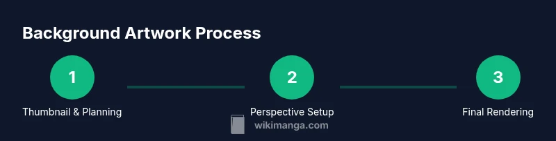
Step-by-step workflow: from thumbnail to final
A reliable background workflow starts with a thumbnail, moves to layout and perspective checks, then builds up linework, texture, and value. Thumbnailing captures composition and camera angle quickly; it’s faster to iterate here than in final art. After selecting a strong composition, lay down perspective grids and anchor points to guide major shapes. Block in large forms—buildings, streets, interiors—without detailing. Then develop linework with a clear separation of planes: near elements get stronger contrast, distant objects soften. Add textures for materials like brick, glass, wood, and metal. Finally render with light and shadow to establish depth, or apply color and atmosphere if you work in color. Always review for readability: is the background supporting the characters’ actions, or does it overwhelm the panel? This workflow balances speed with precision, enabling consistent results across chapters and chapters.
Common pitfalls and how to fix them
Backgrounds often suffer from over-detail, inconsistent perspective, or competing visual priorities. Common fixes include simplifying cluttered areas into essential shapes, aligning all major vanishing points, and ensuring important action remains legible against environmental textures. If a panel feels flat, introduce stronger foreground silhouettes or adjust perspective to reintroduce depth. Too-dark or too-saturated backgrounds can steal focus from characters; reduce contrast or desaturate distant planes to restore balance. When composing, check if the space supports the narrative beat—does the environment push tension, calmness, or movement? Use light guides and edge emphasis to lead the reader’s eye toward the action. Practice by testing multiple versions of a scene with subtle variations and choose the one that tells the story most clearly.
Digital vs traditional: tools, benefits, trade-offs
Digital workflows speed iteration through layers, perspective guides, and adjustable brushes, while traditional methods offer tactile feedback and a unique feel. Digital artists often start with a digital thumbnail, import perspective grids, and use separate layers for linework, textures, and color. Traditional artists may sketch on translucent paper, ink fresh linework, and layer washes or textures by hand to achieve organic textures. Each method demands discipline: digital work benefits from organized layer naming and perspective templates; traditional work benefits from careful planning of paper texture, ink type, and brush pressure. Consider a blended approach: rough thumbnails and perspective studies on paper, followed by digital refinement for final textures, lighting, and color. The goal is to leverage strengths of both methods while maintaining consistency in the world you’ve built.
Practical examples: scene walkthroughs
Let’s apply these concepts to a concrete scene: a rain-soaked alley at night. Start with a thumbnail capturing camera angle and mood, then set a horizon line and vanishing points. Block in the alley’s main shapes: walls, a doorway, distant windows. Add foreground elements like trash cans and street signs to guide the eye. Establish texture: wet pavement reflections, brick textures, and metal railings. Introduce lighting: a neon sign reflecting off wet surfaces, creating color echoes that tie the scene together. Finally, refine lines, enhance atmosphere with fog or rain streaks, and adjust values to ensure the characters read clearly against the backdrop. This approach keeps space consistent while letting the story move through the environment.
Final tips: balancing speed and quality
Good background work isn’t about drawing everything at once; it’s about building the space in layers and testing readability. Maintain a reference library, use perspective grids, and continually compare your scene to your storytelling goals. Practice regularly, create quick turnaround scenes to test ideas, and refine your workflow based on feedback from readers or teammates. A steady, repeatable process reduces guesswork and yields stronger, more convincing backgrounds that enhance pacing and mood.
Tools & Materials
- Pencils (HB and 2B)(For rough thumbs and linework)
- Eraser (kneaded)(Soft eraser for corrections)
- Ruler, triangle, or digital ruler(For straight edges and accurate perspective)
- Perspective guides/grid(One-point/two-point/three-point templates)
- Inking tools (pens or brush)(For final linework)
- Reference materials (photos/books)(Mood, textures, architectural details)
- Drawing tablet or software(For digital backgrounds)
- Color swatches or palettes(Color workflow planning)
Steps
Estimated time: 2-3 hours
- 1
Plan the scene with a thumbnail
Create a quick thumbnail to establish composition, camera angle, and key silhouettes. Avoid over-detail; focus on major shapes and how the space will guide the reader’s eye. Validate that the action reads clearly from the chosen viewpoint.
Tip: Keep thumbnails small and fast—you’ll iterate quickly before committing to linework. - 2
Establish perspective and horizon
Draw the horizon line and place vanishing points appropriate for the scene (1-point for simple receding spaces, 2-point for corners, 3-point for dramatic angles). Use construction lines to align walls, floors, and ceiling planes.
Tip: Test multiple perspective grids to ensure depth cues read correctly in negative space. - 3
Block major shapes and depth cues
Rough-in large architectural forms, street planes, or interior scaffolding. Focus on depth hierarchy: foreground shapes should be crisp, mid-ground softer, background most muted. This establishes scale and readability.
Tip: Lock the camera angle before detailing textures to avoid reworking lines. - 4
Add texture and material details
Layer textures for brick, glass, wood, metal, or foliage. Use varied brush strokes or patterns to suggest material without overwhelming the scene. Reserve high-detail textures for foreground elements.
Tip: Keep texture density proportional to distance; distant textures should simplify into shapes. - 5
Refine linework and separate layers
Finalize line clarity and separate near, mid, and far planes with line weight and edge emphasis. Group elements into layers to enable non-destructive adjustments later.
Tip: Use stronger contrast on the foreground to anchor the viewer’s eye. - 6
Render value or color for mood
If working in grayscale, establish a strong value structure: light sources, shadows, and midtones to imply depth. In color, coordinate temperature and saturation to support the scene’s emotion.
Tip: Test color scripts to maintain consistency across pages. - 7
Review readability and storytelling
Check that the background supports action without competing for attention. Ensure that characters remain legible and the scene’s mood aligns with the narrative beat.
Tip: Ask a peer to review for clarity and pacing. - 8
Finalize with edges and polish
Add finishing touches like edge lighting, weather effects, or subtle glow to unify foreground and background. Export at panel resolution with consistent canvas size.
Tip: Keep export settings consistent to avoid mismatched panels in print or web formats.
Frequently Asked Questions
What is the first step in drawing manga backgrounds?
Begin with quick thumbnails to establish composition and camera angle before detailing. This keeps the scene readable and allows rapid iteration.
Start with a quick thumbnail to set the scene and angle.
How do you choose perspective for a background?
Decide between 1-point, 2-point, or 3-point perspective based on the scene’s viewpoint and depth requirements. Use guides to keep lines coherent.
Choose the perspective that best matches the scene’s angle and depth.
Can I draw backgrounds without references?
References help maintain believable architecture, textures, and lighting. Use photos or real-life observations to inform shapes and details.
References help keep backgrounds believable and grounded.
What software is best for manga background art?
Many artists use Clip Studio Paint, Photoshop, or Krita for backgrounds. Choose software with strong perspective tools and layering capabilities.
Pick software that supports layers, perspective tools, and textures.
How long does it take to draw a background page?
Time varies with detail and complexity. Plan sufficient time for planning, layout, inking, and color or value work, then build a repeatable protocol.
It varies, but practice speeds up the process over time.
What are common background mistakes to avoid?
Over-detail, inconsistent perspective, and cluttered textures steal focus from characters. Use clear silhouettes and controlled texture density.
Avoid too much detail and keep perspective consistent.
Watch Video
Highlights
- Plan with thumbnails before linework
- Master perspective to anchor depth
- Balance texture with readability
- Use references for believable environments
- Choose a workflow that fits your style