What Font Do Japanese Manga Use? A Practical Guide for Creators
Explore what font do japanese manga use and why lettering choices shape tone. Learn about hand-lettering, digital fonts, Mincho and Gothic styles, and practical tips for creators and readers.

There isn’t a single font that all manga use. In traditional Japanese manga, dialog is primarily hand-lettered or drawn by a dedicated letterer, while digital tools are used to emulate that look when needed. When a script is typeset digitally, publishers often rely on fonts that mimic hand-lettering and are drawn from Japanese Mincho (serif) and Gothic (sans-serif) families to convey tone. For English translations, font choices vary by license and design goals, but readability and mood remain the guiding principles.
What Font Do Japanese Manga Use and Why It Matters
When you study typography in manga, you quickly realize that there is no universal font across all titles. In fact, the question what font do japanese manga use often yields a layered answer: most dialogue is not set in a single published font across the industry; it is either custom lettering or hand-lettered, tailored to each character’s voice and the scene's mood. For readers, this results in a distinctive, legible look that feels organic, even when the lettering carries a digital veneer. In production, teams decide early on whether to commission a hand-lettered style or to choose digital fonts that mimic that feel. For readers and creators, understanding this distinction helps when you evaluate how a manga’s tone is conveyed and what licensing implications may apply if you plan to publish your own work. In short, the lettering choice helps convey emotion, pace, and character identity just as strongly as the art itself.
You’ll notice that the flow of dialogue in manga favors readability and rhythm. The shapes of characters, the bursts of sound effects, and the spacing around speech balloons all influence how the text reads. This is why many studios prefer a hand-lettered aesthetic for key scenes, while others lean on carefully tuned digital fonts where time or budget constraints exist. The result is a hybrid approach that respects tradition while embracing modern tooling. For fans, recognizing these choices adds depth to the reading experience and helps you appreciate the craft behind every balloon and caption.
The Role of Hand Lettering vs Digital Fonts
In professional manga production, the handwritten look often comes from a dedicated letterer who studies the rhythm of dialogue, pacing, and character voice. Hand-lettered layouts can capture subtle nuances—like a trembling line during an emotional moment or a bold, punchy cadence for action beats—that generic fonts struggle to reproduce. When production timelines require efficiency, studios may rely on digital fonts that mimic the hand-lettered feel, but these fonts are chosen and tweaked to preserve legibility across panels and pages. For readers, the difference is perceptible in the mood and tempo of scenes: hand lettering tends to feel more organic, while digital approximations can feel consistent and scalable. Creators should test multiple options and review how lines wrap within balloons, ensuring that the letters do not collide with artwork or crowd essential visuals. The goal is to maintain a natural reading flow that supports the storytelling pace rather than distracting from it.
Another key factor is the font’s x-height and letter width. In Japanese typography, balancing readability with expressive distortions—such as elongated strokes for exaggerated speech or condensed forms for rapid dialogue—can dramatically alter how a line lands with readers. Letterers also consider punctuation alignment, emphasis marks, and tone modifiers, which can vary between genres and cultural contexts. Even small decisions, like a bold score or a drop shadow on a syllable, can signal emphasis or surprise. Digital tools enable precise alignment and consistent rendering, but the craft of shaping each letter to fit the balloon remains central to effective manga lettering.
Mincho vs Gothic: The Backbone of Japanese Typography
Mincho (serif) and Gothic (sans-serif) are the two foundational families in Japanese typography that influence manga aesthetics. Mincho typefaces tend to have delicate serifs, high contrast between thick and thin strokes, and a formal, traditional feel. They are often used for narration, captions, and more formal dialogue blocks where legibility is paramount without sacrificing elegance. Gothic typefaces, on the other hand, are clean, straightforward, and modern. They provide a clear, compact profile that helps with rapid dialogue and action sequences. In manga, publishers use these families to signal tone shifts: a scene pivoting toward seriousness may lean toward Mincho, while snappier banter or sci-fi settings may adopt Gothic for speed and readability. The choice between Mincho and Gothic also affects the perceived pace of a page. Smaller balloons benefit from Gothic’s straightforward shapes, while longer blocks of narration can benefit from Mincho’s more legible, classic appearance. The hybrid use of these families supports genre cues and emotional resonance without distracting the reader from the artwork.
For creators, the practical takeaway is to test both styles with representative text: place the same dialogue in Mincho and Gothic and observe how it feels in the page layout. Consider your title’s genre, audience age, and cultural expectations. If you plan to publish bilingually, ensure that both fonts harmonize across languages to avoid jarring transitions. Licensing and font availability are practical concerns, so document your choices early in the design phase and keep a style guide for future chapters.
Lettering Workflow in Professional Publishing and Fan Translations
The path from script to balloon in manga involves several moving parts. In professional publishing, a letterer may receive cleaned dialogue scripts and panel layouts from the editor and colorist, then place text within balloons, adjust spacing, and apply emphasis cues with typographic tricks. The interaction between art and text is iterative: the letterer tests line breaks, balloon shapes, and word-wrapping to maximize readability and preserve the page’s composition. For fansub groups and translation teams, the process is similar but may occur under tighter deadlines and with different font constraints. They often substitute fonts that approximate the source material’s feel while ensuring legibility across multiple screen sizes and devices. Communication among artists, translators, and typesetters is essential to avoid misinterpretation of sound effects and dialogue. Regardless of the workflow, consistent typography standards help readers understand the pacing and emotional weight of scenes, making the lettering an integral part of the storytelling experience.
A solid workflow includes a style guide that documents preferred font families, sizing ranges, balloon shapes, punctuation conventions, and how to handle sound effects. This ensures continuity across chapters and even across different artists or translators. Establishing early who approves font choices and how to handle changes can prevent costly revisions later in the production cycle. Creators new to manga lettering should experiment with do-it-yourself lettering templates and gradually migrate to professional workflows as their confidence grows.
Practical Tips for Choosing Fonts in Your Own Manga Project
If you are creating your own manga, the font decision starts with your tone and audience. Begin by identifying the mood of your dialogue: light and humorous, tense and dramatic, or clear and educational? Your answer will guide you toward appropriate font families and weights. Try pairing two font styles: one for narration and one for dialogue to establish a visual hierarchy. Remember that legibility is non-negotiable—avoid overly ornate letters for long dialogue, especially in smaller balloons. Test your choices by printing pages at actual size and viewing them on different devices to ensure readability across reading contexts. Keep an accessible style guide that records the fonts used for character dialogue, narration, and sound effects. If you must use a font you did not license, ensure your use complies with its license terms or seek alternatives that are free for commercial use. Finally, consider the cultural context of your readers; some shapes and diacritics in Japanese fonts carry cultural connotations that can affect interpretation, so choose with awareness and intention.
Licensing and Rights: What You Can Use Legally
Font licensing is a critical consideration for any manga project, especially if you plan to publish commercially or distribute digitally. Some fonts are free for personal use but require a commercial license for publishing; others may demand licensing fees or have limitations on redistribution. If you are publishing in Japanese, you may encounter fonts bundled with your design software or available through design marketplaces with varying license terms. A practical approach is to favor fonts that clearly state their licensing terms for commercial use, or to commission custom lettering from a professional letterer who can provide a unique, original look with clear usage rights. For English translations, licensors often require separate licenses for each language version of the work. Respecting licensing not only avoids legal risk but also supports the artists and font designers who contribute to your manga’s distinctive appearance. If you are unsure, consult a licensing guide or a legal professional who specializes in creative works.
Case Studies: Tone and Legibility Across Genres
Across different manga genres, lettering choices reflect genre conventions and pacing. Action titles tend to favor bold, compact letterforms to convey speed and impact, with sound effects designed to pop against the artwork. Drama and romance may use lighter, more expressive strokes to suggest emotion, interspersed with occasional bold cues for emphasis. Comedy often relies on playful, rounded shapes that mirror a lighthearted narrative voice. The lettering approach may shift within a single series to support dramatic reveals or narrative shifts, emphasizing how typography works in tandem with the art. While some series lean on consistent branding for recognizability, others experiment with subtle variations from arc to arc to reflect character growth or changing settings. Understanding these patterns helps creators select fonts that align with genre expectations while maintaining readability and visual harmony with artwork.
Common Pitfalls and Troubleshooting for New Manga Letterers
New letterers frequently encounter issues around spacing, balloon shape, and legibility. A common pitfall is overly tight tracking, which can cause letters to collide within balloons and hinder readability. Another frequent problem is using fonts with inconsistent x-heights, making dialogues appear misaligned across panels. To troubleshoot, start by adjusting line breaks to minimize hyphenation and awkward splits, and test with multiple panel sizes. Use a baseline grid to maintain consistent line positions across pages, which helps eye-tracking as readers move from panel to panel. Be mindful of the distribution of text in narration blocks versus dialogue, ensuring the narration remains readable without overpowering dialogue. Lastly, always test your pages on the target devices readers will use, and solicit feedback from beta readers who can point out legibility issues that may not be obvious on a designer’s screen.
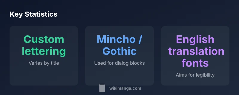
Comparison of font usage in manga production
| Aspect | Typical Approach | Notes |
|---|---|---|
| Dialog content style | Custom lettering or hand-lettered, with occasional digital support | Aimed at mood and character voice |
| Font categories in Japanese print | Mincho (serif) and Gothic (sans-serif) | Used to signal formality vs. modern tone |
| English translations fonts | Licensed or fan-created options | Balance mood with legibility across languages |
| Production workflow | Letterer, typesetter, editor collaboration | Precise layout and pacing are key |
Frequently Asked Questions
Do all manga use standard fonts for dialogue?
Not necessarily. Many titles rely on hand-lettered or custom lettering to capture voice and mood. When digital, fonts that mimic hand-lettering are used, but they are carefully selected and sometimes modified to fit the page.
Most manga uses custom or hand-lettered dialogue, with digital options chosen to match the feel.
What is the difference between Mincho and Gothic in manga typography?
Mincho offers serif elegance and is good for narration, while Gothic provides a clean sans-serif look suitable for fast dialogue and action. Many titles switch between them to signal tone shifts.
Mincho is serif and traditional; Gothic is sans-serif and modern, used to signal mood changes.
Can I use manga-style fonts for my own self-published work?
Yes, provided you respect the font’s license. If licensing is unclear, consider commissioning custom lettering or choosing fonts explicitly listed for commercial use.
Make sure the font license allows commercial use or get a custom letterer.
Are there licensing concerns with fonts for translations?
Translations must respect each font’s license terms, which may require separate licenses for different languages or distribution formats.
Licensing for translations can require separate rights; check each font's terms.
Where can I legally obtain fonts for manga lettering?
Look for fonts with explicit commercial-use licenses or consider hiring a letterer to create a custom look with clear rights.
Choose fonts with clear commercial licenses or hire a letterer for a custom look.
What should I test when choosing fonts for my manga?
Test legibility across panel sizes, print versus screen readability, and how well the font supports punctuation and sound effects.
Test readability on print and screen, and check punctuation support.
“Effective manga lettering blends craft with legibility, and most studios rely on a mix of custom and carefully chosen type to convey character and mood.”
Highlights
- There is no single standard font for manga lettering.
- Hand-lettering and custom lettering are central to visual voice.
- Mincho and Gothic styles shape tone and readability.
- A thoughtful workflow preserves harmony between text and art.
- Licensing and rights impact font choices for publishing.