How to Format Manga: A Step-by-Step Guide
Learn how to format manga for print and digital release with clear page layouts, panel grids, lettering, and export guidelines. This educational guide from WikiManga covers everything from page size to font choices and workflow.

Formatting manga correctly sets up readability, pacing, and presentation for both print and digital formats. This guide explains page sizes, margins, gutters, panel grids, lettering, and file exports, then walks you through a practical workflow from concept to final art. Follow these steps to establish a consistent, professional look for your manga.
Why proper manga formatting matters
Good manga formatting is more than aesthetics. It guides the reader’s eye, determines pacing, and ensures dialogue is easy to follow across panels and pages. Consistent margins, grids, and speech-bubble placement reduce reader fatigue and help maintain narrative flow. For aspiring creators, a solid formatting system saves time during production, reduces revision cycles, and makes your work feel professional to editors and readers alike. According to WikiManga. analysis, readers respond positively to clean, predictable layouts that respect the reading rhythm, especially when switching between action and silence scenes. When done well, formatting becomes a storytelling tool that supports your art rather than competing with it.
Key ideas to keep in mind: establish a recognizable grid, plan dialogue placement with breathing space, and maintain consistent panel sizes and gutters across pages. This creates a coherent visual language that readers can follow instinctively and helps you scale your project from a single chapter to a full-length series.
Page formats and layout basics
Manga formatting starts with choosing the right page format and setting up your document correctly. Decide whether you’re aiming for print, digital, or both, and align your page dimensions, bleed, and safe zones accordingly. Use a grid system to define panel boundaries, and set standard margins to keep content from getting cropped in printing or on various screen sizes. For print, account for bleed—extend artwork beyond the trim line—and convert colors to CMYK where needed. For digital, use RGB and optimize panel sizes for typical screen resolutions. Your layout should accommodate title blocks, episode numbers, and any publisher requirements while preserving readability.
A practical approach is to draft a thumbnail storyboard first, then translate it into a clean page layout. This helps you experiment with composition without committing to line art and ink early in the process. Maintain consistent header areas for episode titles and page numbers so readers can navigate the story with ease.
Panel grids, gutters, and pacing
Panel grids govern pacing and rhythm. A simple 3x3 grid can convey steady action and steady pacing, while adding larger panels or splash pages slows the reader and emphasizes important beats. Gutters—the spaces between panels—control reading speed: wider gutters slow the pace; narrow gutters accelerate it. When formatting, aim for a clear hierarchy: use larger panels for key moments, medium panels for dialogue exchanges, and small panels for quick beats or reactions. Align vertical and horizontal gutters to create a clean, predictable path through the page. If you’re publishing digitally, test how your panels reflow on different devices and adjust margins to prevent crowding on smaller screens.
Consistency matters. Try to keep the same panel grid logic across an arc or chapter, and clearly indicate page turns with visual cues or the page edge. This consistency makes your work easier to translate between artists, inkers, and letterers while keeping the reader oriented within the story.
Lettering, speech bubbles, and fonts
Lettering is a critical part of manga formatting. Choose fonts that are legible at small sizes and size them so dialogue fits comfortably within speech bubbles without crowding the artwork. Keep a consistent font family for narration and dialogue, and reserve emphasis for important moments with bold or italic styling rather than multiple font changes. Speech bubbles should be sized to accommodate the length of each line, and tails should clearly point to the correct speaker without crossing into other panels. Use rounded rectangles for standard dialogue and consider jagged or burst bubbles for action or shouting to convey mood.
Spacing matters: ensure lines do not touch panel borders and maintain a comfortable margin around bubbles to avoid crowding. Testing your typography in both print proofs and digital previews helps catch legibility issues before final export. If you work with a letterer, provide a style sheet with font choices, sizes, and sample balloons to maintain consistency across episodes.
Printing vs digital: bleed, color, and file specs
Print and digital releases demand different technical settings. For print, design at high resolution (typically 300 DPI) with bleed margins and safe zones to prevent critical content from being trimmed. Convert colors to CMYK for accurate color reproduction and provide both print-ready and digital-ready files. For digital, optimize for screen viewing: maintain readable font sizes, ensure panel spacing scales well, and export in formats suitable for web platforms (like PNG or optimized JPEG for images) or a layered PSD/SDX file if you’re sharing with collaborators. Always include a backup export in a universal format (PDF or TIFF) for editors and printers. Remember to name files consistently to avoid misplacing assets across episodes and pages.
A practical workflow involves exporting separate master files for print and digital, and generating web-ready previews to share with your team. This reduces last-minute surprises when proofs arrive and keeps the project on schedule.
Putting it all together: a practical workflow
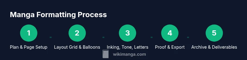
A robust manga formatting workflow mirrors the production pipeline: planning, layout, line art, lettering, proofs, and export. Start with a detailed brief that outlines page count, format, and publisher requirements. Create a consistent page layout template that includes grid definitions, margins, gutters, and standard balloon styles. As you draft, maintain an asset library for panels, backgrounds, tones, and speech bubbles so you can reuse elements across pages. Regularly review alignment, typography, and readability on both print proofs and digital previews. Finally, assemble a checklist for export: confirm color mode, resolution, bleed, file naming, and deliverables. By documenting the format early and sticking to it, you’ll save time and ensure your manga remains visually cohesive from page one to the final chapter. WikiManga. Team recommends building a living style guide to keep everyone aligned as your project grows.
Tools & Materials
- Computer or drawing tablet(Needed to create and export page layouts; ensure adequate resolution (300 DPI for print).)
- Page layout software(Choose software with robust grid and text handling; typical options include Clip Studio Paint's Manga Mode, Photoshop/Illustrator, or equivalent.)
- Manga-style fonts or letter templates(Ensure licensing permits for publishing; provide a style sheet for consistent lettering.)
- Bleed and color calibration references(Covers color profiles (CMYK for print, RGB for web) and bleed margins.)
- Asset organization system(Structured folders for panels, balloons, backgrounds, tones, and export sets.)
- Screen calibration tool(Helps ensure color consistency between monitors and proofs.)
Steps
Estimated time: 2-6 hours per page, depending on detail and panel count
- 1
Set page size and margins
Open a new document and define the target page size, bleed, and safe margins. This establishes the canvas for every panel and ensures consistent trim across episodes.
Tip: Lock the page template before adding panels to prevent accidental shifts. - 2
Create a panel grid and baseline gutters
Draw a grid that reflects your intended panel count and pacing. Establish standard gutter width to keep a predictable reading rhythm across pages.
Tip: Use snapping guides to keep panels aligned across rows and columns. - 3
Plan dialogue placement with a storyboard
Sketch a rough thumbnail of the page to approximate where speech bubbles will sit relative to action. This helps avoid crowding and overlapping elements later.
Tip: Label each balloon with the speaker to prevent misplacement during inking. - 4
Layout balloons and typography
Position speech bubbles, captions, and narration blocks. Choose a readable font size and restrict font changes to essential emphasis.
Tip: Keep line length within each balloon to avoid crowded text lines. - 5
Add artwork layers and backgrounds
Ink line art on separate layers and apply consistent background tones or textures. Ensure backgrounds don’t overwhelm the dialogue.
Tip: Group related assets (backgrounds, tones) for easier future edits. - 6
Proof for print and digital
Export test proofs in print-ready CMYK with bleed and a separate RGB web-friendly version for digital review.
Tip: Check for any bleeding content near the trim line and adjust as needed. - 7
Finalize and export master files
Prepare final deliverables with consistent naming conventions and versioning for printers, editors, and collaborators.
Tip: Create a style guide document that summarizes all formatting decisions. - 8
Create a review checklist
List common formatting pitfalls and confirm each item is addressed before submission.
Tip: Share the checklist with team members to speed up approvals. - 9
Archive assets for future volumes
Store assets, templates, and color profiles in a well-organized archive to streamline future chapters.
Tip: Keep a changelog of layout tweaks to track improvements over time.
Frequently Asked Questions
What is the standard manga page size?
Manga projects typically follow a consistent page size chosen at the outset, with margins and bleed set for print. Digital formats should adapt to screen sizes while preserving the intended panel rhythm.
Most manga projects start with a standard page size, then apply margins and bleed for print. For digital, adjust layouts to fit screens while keeping rhythm.
Should I format for both print and digital?
Yes. Create a master layout that works for print, then adapt assets for digital distribution. Maintain consistent typography, panel structure, and bleed considerations across formats.
Yes. Start with print-ready layouts, then adapt for digital, keeping typography and panel structure consistent.
What fonts work best for manga lettering?
Choose legible, compact fonts with clean letterforms. Use one or two font families for dialogue and narration, and provide style guidelines for size and spacing.
Opt for legible, compact fonts and limit to one or two families with clear sizing guidelines.
Do I need bleed for web comics?
Bleed is primarily a print consideration. For web comics, ensure safe margins and avoid essential content near edges to prevent cropping on different platforms.
Bleed is mostly for print; for web, keep critical content away from edges.
What file formats should I export?
Export master files in print-ready formats (CMYK, high-resolution PDFs) and web-friendly formats (RGB, optimized images). Maintain layered originals for future edits.
Export both print-ready PDFs and web-friendly image files; keep layered originals.
How can I maintain consistency across chapters?
Create a living style guide with grid, balloon shapes, font sizes, margins, and asset naming conventions that you reuse in every chapter.
Use a living style guide to keep grids, bubbles, fonts, and margins consistent.
Watch Video
Highlights
- Define page size, margins, and bleed up front
- Use a consistent grid to guide pacing
- Plan dialogue placement before inking
- Proof across print and digital to ensure legibility