How to Make a Manga Cover: A Practical Guide
Learn how to craft an eye-catching manga cover with practical steps, composition, typography, and color theory. This WikiManga guide walks aspiring artists through concept, layout, export, and real-world examples.

You will learn how to design a manga cover that grabs attention, communicates genre, and supports your story. Start by defining the tone, choosing a focal character, planning layout, and selecting typography and colors. Gather a sketchbook, a drawing app, and a source of reference art to begin. This brief guide covers concept, composition, color, typography, and export steps.
Understanding the Purpose of a Manga Cover
According to WikiManga, a manga cover is your first handshake with a reader. It should convey the story’s tone, hint at the genre, and promise what lies inside, all while remaining legible at thumbnail size. A strong cover communicates mood through composition, lighting, and color choices, and it should work both as a standalone artwork and as part of a longer series branding. When you design with purpose, you guide potential readers toward the feeling your story offers and set expectations for pacing, art style, and character dynamics. This section helps you define the core purpose before you draw a single line.
Research and Inspiration
Inspiration is the starting point for a credible cover. Study successful manga covers in your target genre to identify common motifs, color schemes, and typography styles. Create a mood board with a mix of covers that evoke the tone you want—whether lighthearted, dark, action-packed, or slice-of-life. Note how titles are animated, where the focal point sits within the composition, and how negative space is used to separate characters from the background. WikiManga emphasizes gathering diverse references to avoid copying and to spark original ideas that align with your story.
Core Elements of a Cover
A compelling manga cover balances four core elements: focal point, silhouette readability, typography, and color harmony. The focal point should be a character or emblem that immediately tells the viewer who or what the story is about. Typography must be legible at small sizes, with contrast between the title and background. Color harmony ties the mood together; use complementary or analogous schemes to reinforce genre cues. Layer management and clean edges help mobile readers recognize the design instantly, even when scaled down.
Character Pose and Composition
Pose and composition drive emotional impact. Position the main character off-center to create dynamic tension, and use diagonal lines or implied movement to guide the eye toward the title. Consider expressive facial cues and body language that reflect the story’s stakes. A simple character silhouette can often convey more than a complex scene. Keep background elements minimal so the focal point remains clear. This approach improves readability across print and digital thumbnails.
Typography and Color Palette
Typography should be bold yet legible, with the title occupying a clear visual hierarchy. Choose a font family that matches your genre, such as bold sans-serif for action or elegant script for romance, and ensure contrast against the backdrop. Limit to two or three colors for cohesion, then add an accent color to highlight action or emphasis. Test the cover at thumbnail scale to verify legibility and avoid thin or highly stylized letters that blur when reduced.
Thumbnail Readability and Back Covers
A successful manga cover reads well as a small thumbnail and remains impactful on shelf and digital storefronts. Prioritize high-contrast elements, strong silhouettes, and legible typography. For back covers or spines, include a short blurb, author name, and series logo at a readable size. Remember that many readers will glimpse the cover first in a feed or search results, so make every element count in a compact space.
Cover Sketching and Layout Planning
Begin with rough thumbnails to explore composition, then tighten the layout into a clean line drawing. Use a grid or rule of thirds to place the focal point and title. Create multiple variations quickly to compare balance, readability, and mood. This planning stage saves time later and helps you articulate your concept before committing to final art.
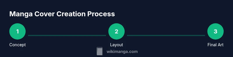
Step-by-Step Process Overview
Think of cover creation as an end-to-end workflow: concept, composition, sketching, inking, coloring, typography, export, and review. Start with a clear brief: genre, mood, and key characters. Iteration matters—draft several variants and compare how well they communicate the premise. Always validate the design at target sizes to ensure readability.
Tools and Materials for Creating a Manga Cover
You will need a drawing surface (physical or digital), a reading-size sketchpad, and a good set of brushes or brush presets. A reliable graphics tablet or stylus speeds up iteration. Software choices vary from raster programs like Procreate or Photoshop to vector tools for crisp text. Keep a color reference library handy and organize layers from rough sketch to final art to simplify edits.
Common Mistakes and How to Fix Them
Common errors include cluttered compositions, overly similar color palettes, and tiny typography that loses readability. Fix by simplifying shapes, testing the design in grayscale to check contrast, and increasing title weight. Avoid heavy textures behind light typography, and ensure your focal point stays prominent when scaled down. Regularly step back from the canvas to evaluate overall balance.
Exporting, Resolution, and File Formats
Export settings vary by platform: print requires high-resolution files with color profiles appropriate for the press while digital platforms benefit from optimized web formats. Save Master files in editable formats (PSD/AI) and create final PNG or JPEG exports at the required dimensions and DPI. For print, confirm bleed areas and color calibration; for online stores, ensure correct aspect ratios and compression levels.
Real-World Examples and Practice Project
Study real-world covers in your target genre and deconstruct what makes them effective: focal pose, typography, color storytelling, and balance. Create a practice project that reimagines an existing cover with distinct styling to reinforce original voice. Compare your result against references to iteratively improve composition, readability, and mood.
Tools & Materials
- Pencil and eraser(HB or 2B for light sketch lines)
- Sketchbook or drawing tablet(A4/A5 size or equivalent canvas)
- Ruler and grid templates(For precise composition and alignment)
- Digital illustration software(Examples: Procreate, Clip Studio Paint, Photoshop)
- Inking tools (optional for traditional art)(Brush pens or digital inking brushes)
- Typography fonts or font library(Select legible, genre-appropriate fonts)
- Color references and swatches(Curate palettes that match mood and genre)
- High-resolution display(Monitors with good color accuracy help at final check)
- Export templates (PSD/AI/SVG)(Keep editable files for future revisions)
- Stock textures or patterns (optional)(Use sparingly to avoid clutter)
Steps
Estimated time: 60-90 minutes
- 1
Define concept and mood
Outline the story tone, genre, and target audience. Create a one-sentence concept that your cover will communicate and use it as a north star for all decisions.
Tip: Write the concept as a quick caption you can reference during design. - 2
Sketch layout and focal point
Draw several thumbnail layouts, experimenting with where the main character, emblem, or scene will sit. Prioritize a clear focal point that reads at small sizes.
Tip: Use a simple graph to align title, character, and background elements. - 3
Choose typography and title treatment
Select fonts that reflect genre and ensure high contrast with the background. Test weights and letter spacing to maintain legibility.
Tip: Avoid more than two font families on a single cover. - 4
Pick color palette and mood
Limit to 3-4 colors with an accent color. Use color to convey emotion and guide eye movement toward the title.
Tip: Create a grayscale version to test readability without color cues. - 5
Refine line art and colors
Ink final lines, then block in flat colors. Add shading and highlights to create depth without overwhelming the composition.
Tip: Keep edges clean for print clarity. - 6
Add background and texture selectively
Introduce background elements only where they support the focal point. Use textures sparingly to avoid noise.
Tip: Check that textures don’t muddy the title legibility. - 7
Finalize typography and branding
Ensure title and author name align with the cover’s grid. Include a small series logo if applicable.
Tip: Test at thumbnail size and mobile screens. - 8
Export assets for print and web
Export editable master files and web-optimized images with correct color profiles and dimensions.
Tip: Include bleed marks for print versions.
Frequently Asked Questions
What is the first step in making a manga cover?
Start with a clear concept and mood. Define the genre and audience to guide composition and color choices.
Begin with a clear concept and mood to guide all design decisions.
Should I sketch by hand or start digital?
Both work well. Start with rough hand sketches to explore ideas, then digitize for refinement and color.
You can start with hand sketches and then move to digital for refinement.
What resolution should I use for print vs. online?
Print typically requires higher resolution with color management; online versions use smaller, optimized files.
Use higher resolution for print and optimized files for online viewing.
Can I reuse character designs from another series?
Reuse is not advised unless you have rights or licenses. Create original elements to avoid copyright issues.
Avoid reusing designs without proper rights; create original art or licenses.
What file formats should I export?
Export editable master files (PSD/AI) and web/print finals (PNG/JPG, PDF for print).
Export editable masters plus print and digital-ready finals.
Watch Video
Highlights
- Define concept before drawing.
- Prioritize bold readability at thumbnail size.
- Keep typography consistent and legible.
- Export print and web-ready assets properly.